Trooth brand guidelines
Files and rules for presenting the Trooth brand consistently.
Download brand assetsNaming
- "Trooth" is one word with a capital "T", never all capitals in running text.
- Trooth is the company. The product is the Trooth Network, not "Trooth app".
- Named things keep their capitals: the Trooth Network, a Trust Profile.
Usage
Give assets space at any size. The mark's square canvas is its clear space; keep it empty.
The Trooth name and mark are the property of Trooth, LLC.
- Do not alter, recolor, redraw or reduce them.
- Do not enclose the mark in a shape or combine it with other marks.
- Do not imply affiliation with or endorsement by Trooth without written consent.
Trooth Wordmark




The wordmark is the mark beside the name in Open Sauce One, as in the site header. Use it where space allows, monochrome only.
Trooth Logo




In tight layouts the mark can stand alone. Elsewhere, prefer the wordmark, which carries the name.
The mark is the Enhanced Compact Witness: a witness with binoculars, one lens an evidence document, the other a search symbol. It is one shape in one color.
Never color it, enclose it, pre-round it, or simplify or redraw it for small sizes.
Trooth Icon



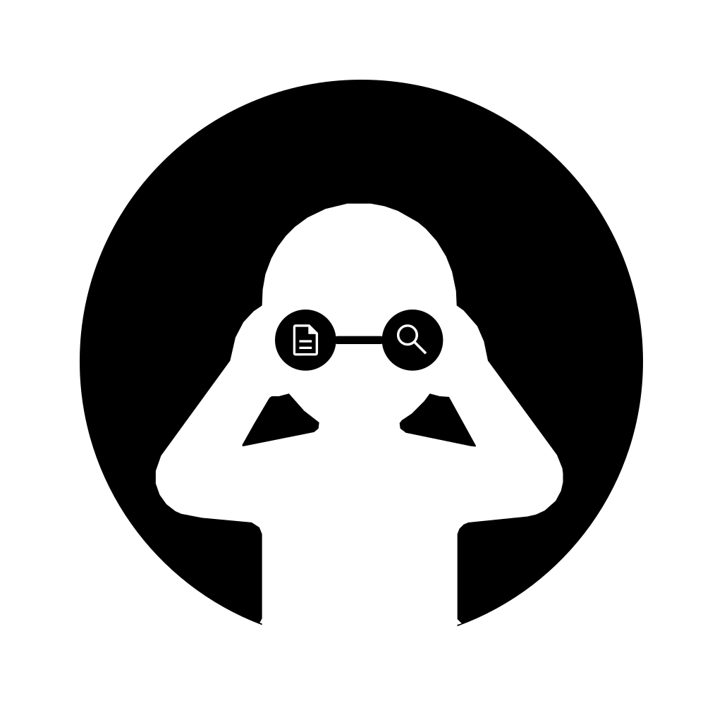
For Trooth as a company, such as social avatars or square chips, use the mark on an opaque square, white on black or black on white.
Only here is a corner radius allowed. The figure shows 22%; files ship square for platforms to round.
Colors
The site draws the mark in Ink on light, Paper on dark; files are pure black and white.
Brand blue, #1A73E8 (RGB 26, 115, 232), is for actions only and never touches the mark.
Typography
Trooth uses one typeface, Open Sauce One, on every surface: site, badge, share cards, emails, documents. No second face, no monospace.
It is self-hosted under the SIL Open Font License, shipped with the files.
- Regular, 400Trooth 1234Headings and body text.
- Italic, 400Trooth 1234Titles of works and the occasional stress.
- Medium, 500Trooth 1234Labels, buttons and navigation.
- SemiBold, 600Trooth 1234Names in a list and figures.
- SemiBold Italic, 600Trooth 1234Emphasis inside a strong line.
- Bold, 700Trooth 1234Rarely; a single word the reader must not miss.
- Headings: regular weight at large sizes, with tight tracking.
- Body text: regular at 16px, never below 14px.
- Labels: medium.
Describing Trooth
Short description: "Machine-Readable Trust company profiles for people and AI agents."
Long description: "Trooth is an infrastructure and cybersecurity company providing Machine-Readable Trust. The Trooth Network brings company declarations and dated observations into a source-labeled record that people and AI agents can inspect." Use the first sentence, in present tense, for every introduction.
The hierarchy behind both:
- Company: Trooth.
- Industry: infrastructure and cybersecurity.
- Category: Machine-Readable Trust.
- Product: the Trooth Network, the only one. Its public application programming interface, command-line tool, Model Context Protocol server, badge and webhooks are ways to read it, not separate products.
Nothing on the Network is for sale.
Trooth is a witness. It records what it observed in connected systems and public records, with source and date, and never signs for a company.
It does not certify, endorse, rank or grade, and no one can pay to change a record. People read with no account; agents read over the API and MCP server.
Terminology
- A company's public page on the Network is its Trust Profile.
- Say the Trooth Network first, then the Network; the directory is only the browse page at /network.
- A company works in its company workspace and a buyer in its buyer workspace.
- Write sub-processor with the hyphen, use American spelling, and do not use em dashes.
Provenance words
The word beside a fact says where it came from, and the word is the claim.
- Witnessed: Trooth observed it itself, with a source and a date.
- Public record: read from an authoritative public or registry source, never from the company.
- Attested: a named party declared it; Trooth recorded it without establishing it.
- Declared: the company stated it, shown in its own words.
Public-record, company-declared, counterparty-attested and Trooth-witnessed facts are reported apart, never added together. A company cannot change a fact's word.
Claim rules for authors, human or AI-assisted
These rules bind everyone writing as Trooth, including AI-assisted drafts; the publisher answers for every claim.
- Read is Trooth's verb. Write checked only for live observations, witnessed only for Trooth's own, attested only for a named party's declaration.
- Do not write verified or certified about a company.
- Do not sum a company up in a number or sort companies into levels.
- Do not say a company has a standing: Trooth confers nothing.
- Do not describe a reading as a scan.
- Do not promise a cadence: only live probes are re-read hourly; other facts age on their category's window.
- Describe what a capability does today, and narrow unsupported claims instead of using the future tense.
The mark is new and still evolving. Questions: hello@trooth.co.